
34+ Free Sample Pareto Chart Templates (EXCEL, PDF)
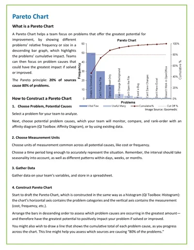
A Pareto Chart Template is a visual tool used in data analysis that combines both a bar chart and a line graph to identify and prioritize the causes of a particular problem. The bars, displayed in descending order, represent the frequency, count, or cost of issues, thereby highlighting the most significant factors.
Correspondingly, the line graph, which overlays the bar chart, cumulatively shows the total percentage of these factors. This template is based on the Pareto Principle, also known as the 80/20 rule, which posits that roughly 80% of effects come from 20% of the causes, enabling users to target and address the most influential factors effectively.
Download Free Sample Pareto Chart Templates
What is a Pareto Chart?
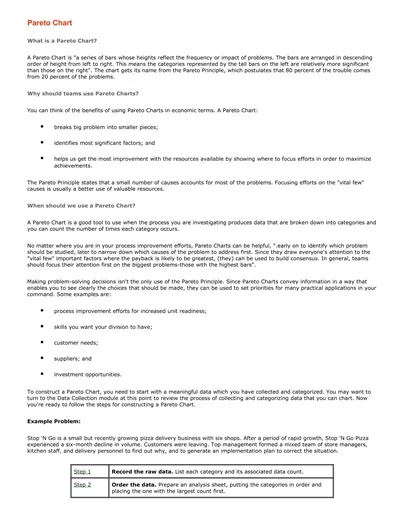
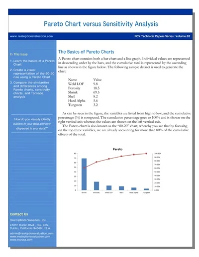
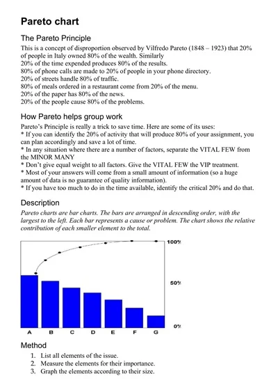
A Pareto Chart is a graphical tool used in quality control and business to identify and prioritize problems or causes of issues in a process by frequency of occurrence. It combines a bar chart and a line graph, where individual values are represented in descending order by bars, and the cumulative total is represented by the line.
This visualization helps to highlight the most significant factors contributing to an overall effect, based on the principle that 80% of problems are often due to 20% of cases, known as the Pareto Principle or the 80/20 rule.
Types of Pareto Chart
Pareto Charts are an essential tool in quality control and project management, used to highlight the most significant factors in a data set.
There are several types of Pareto Charts, including:
1. Static Pareto Chart
Static Pareto Charts are used to analyze data collected over a specific period. They provide a snapshot view, helping identify the major issues affecting a system at a particular time.
2. Dynamic Pareto Chart
Dynamic Pareto Charts track changes over time, allowing users to monitor how the relative importance of different factors evolves. This type is particularly useful for ongoing processes and continuous improvement efforts.
3. Comparative Pareto Chart
Comparative Pareto Charts are used to analyze and compare different data sets side by side. This approach is helpful when comparing issues or problems across different departments, locations, or periods.
4. Weighted Pareto Chart
Weighted Pareto Charts assign weights to different categories or issues based on their importance or impact on the process or system being analyzed. This variation helps prioritize problems not just by their frequency but by their significance.
Key Components of a Pareto Chart
The Pareto Chart is a powerful tool for analyzing and prioritizing issues or tasks by highlighting the most significant factors in a dataset.
Its key components include:
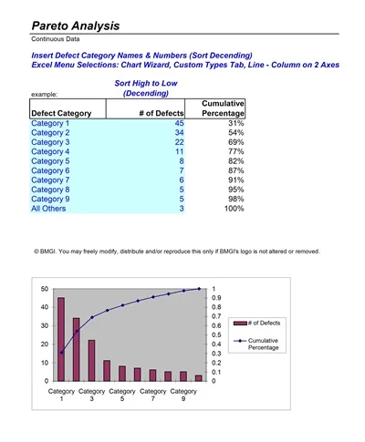
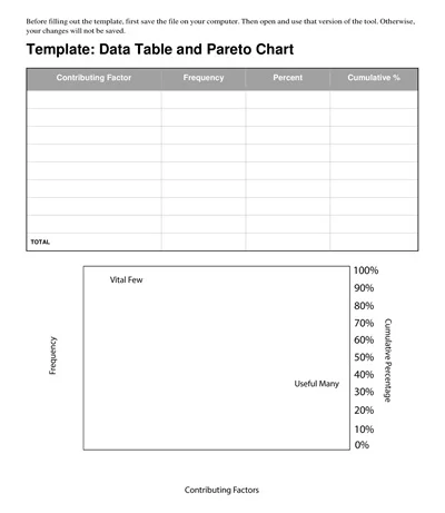
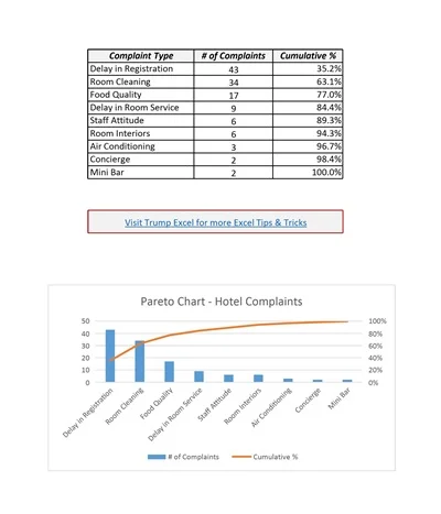
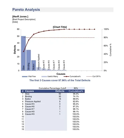
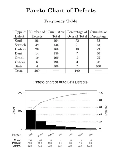
- Title: Describes what the Pareto Chart represents.
- Horizontal Axis (X-axis): Typically shows the categories or groups being compared.
- Vertical Axis (Left side, Y-axis): Indicates the frequency, count, or another metric that measures the categories, often in descending order.
- Vertical Axis (Right side, Y-axis): Usually represents the cumulative percentage of the total, aiding in identifying the “vital few” from the “trivial many”.
- Bars: Each bar represents a category or group, with the height corresponding to its value or frequency. The bars are ordered from highest to lowest, moving from left to right.
- Cumulative Line: A line graph that starts on the first bar and ends on the last, showing the cumulative percentage of the total as it progresses from one category to the next.
Uses of Pareto Charts
Pareto Charts are a powerful analytical tool used in various fields to prioritize issues or causes of a problem by their relative importance.
Below are some key uses of Pareto Charts:
Identifying Key Issues
By highlighting the most significant factors contributing to a problem, Pareto Charts help teams focus on the causes that will have the most substantial impact if solved.
Improving Quality Control
In manufacturing and quality management, these charts are used to identify the most common sources of defects, enabling targeted quality improvement initiatives.
Time Management and Resource Allocation
They assist in identifying the most time-consuming tasks or those that consume disproportionate resources, allowing for more efficient time and resource management.
Analyzing Customer Feedback
Pareto Charts can categorize customer complaints or feedback, helping businesses prioritize responses and improvements on products or services.
Process Optimization
By identifying and focusing on the most critical issues affecting a process, organizations can optimize operations more efficiently, leading to cost reduction and an increase in productivity.
When To Use A Pareto Chart
In the world of data analysis and quality improvement, few tools are as simple yet powerful as the Pareto Chart. Named after Vilfredo Pareto, an Italian economist who observed that 80% of Italy’s wealth belonged to only 20% of the population, the Pareto Principle has found applications far beyond economics.
Today, it serves as a fundamental concept in time management, business, and process improvement strategies. A Pareto Chart, effectively, is a visual representation of the Pareto Principle, helping users identify the most significant factors in a dataset. But when is the right time to use a Pareto Chart? This post dives into the core scenarios where applying a Pareto Chart can be incredibly beneficial.
Common Mistakes to Avoid in Pareto Chart
Pareto charts are a powerful tool for anyone looking to improve processes or solve problems in a business context. By identifying the few critical causes contributing to a problem, teams can focus their efforts on where they will have the greatest impact.
However, as with any analytical tool, errors in creation and interpretation can lead to misguided efforts and lost resources. This post will explore common mistakes to avoid when working with Pareto charts to ensure your analysis is both effective and efficient.
1. Overlooking Data Collection and Classification
One of the most critical steps in creating a Pareto Chart is gathering and classifying your data accurately. A frequent mistake is not collecting enough data over a sufficient period, leading to an analysis that might not capture the full scope of the issue. Similarly, poorly classified data can result in a Pareto Chart that misrepresents the significance of various factors.
How to Avoid:
- Ensure Comprehensive Data Collection: Collect data over an adequate timeframe to capture all relevant variations.
- Classify Data Carefully: Be meticulous in classifying data into meaningful categories that accurately reflect the nature of the problems or causes.
2. Ignoring Small Problems
While the Pareto Principle suggests focusing on the “vital few” causes that contribute to the majority of the problem, disregarding the “trivial many” can be a mistake. Sometimes, small problems can aggregate into a significant issue, or they may be symptomatic of a larger, underlying problem.
How to Avoid:
- Monitor Small Issues: Keep an eye on less significant categories for patterns or trends that may indicate a more substantial problem.
3. Failing to Update the Chart
A Pareto Chart is a snapshot of a specific period. Not updating your chart to reflect new data can lead to outdated conclusions. Continuous improvement processes require up-to-date information to be effective.
How to Avoid:
- Regularly Update Your Chart: As you implement changes and gather new data, update your Pareto Chart to ensure it reflects the current state of affairs.
4. Overcomplicating the Chart
Adding too many categories or details can make your Pareto Chart difficult to read and interpret. Simplicity is key to effectively communicating the most critical information.
How to Avoid:
- Limit Categories: Focus on a manageable number of categories that represent the most significant contributors to the problem.
- Use Clear Labels: Ensure your chart is easily understandable at a glance by using clear, concise labels.
5. Misinterpreting the Chart
A common mistake is viewing the Pareto Chart as an all-encompassing solution that dictates immediate action without further analysis. While the chart highlights key problem areas, it’s essential to conduct a deeper investigation into the causes behind these problems before implementing solutions.
How to Avoid:
- Further, Investigate: Use the Pareto Chart as a starting point for a more detailed analysis of the top problem areas.
- Consider External Factors: Understand that external factors not represented on the chart might influence the data.
6. Neglecting the Human Element
Data analysis tools like the Pareto Chart are incredibly useful, but they cannot replace human judgment and insight. Forgetting to consider the human element, such as employee feedback or customer opinions, can result in solutions that look good on paper but fail in practice.
How to Avoid:
- Engage Stakeholders: Involve those who are directly affected by the issues represented in the Pareto Chart in the problem-solving process.
- Use Common Sense: Always pair data analysis with practical knowledge and situational awareness.
How to Create a Pareto Chart Template
Creating a Pareto chart template can be done using various software tools such as Microsoft Excel, Google Sheets, or specialized statistical software like Minitab or Tableau.
Here’s a step-by-step guide on how to create a Pareto chart:
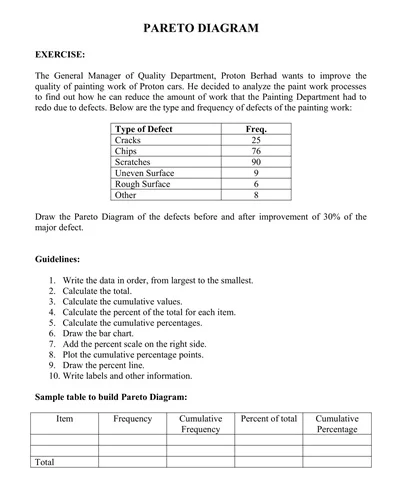
Step 1: Gather Your Data
The first step in creating a Pareto Chart is compiling the data you need to analyze. This data typically revolves around quality defects or issues that need addressing. For instance, if you’re looking to improve customer service, your data might include the types of complaints received.
Step 2: Categorize Your Data
Once you have your data, the next step is to categorize it based on the type of issues, reasons for defects, or any other relevant classification. This step is crucial for identifying patterns and areas that require attention.
Step 3: Calculate the Frequency
After categorizing your data, calculate how often each category occurs. This frequency will help you identify which issues are most common and, therefore, may require more focus.
Step 4: Order the Data
Arrange your categories in descending order, from the most frequent to the least. This ordering is what gives the Pareto Chart its power, visually emphasizing the most significant issues.
Step 5: Calculate the Cumulative Percentage
Next, calculate the cumulative percentage of each category. This calculation involves adding each category’s frequency from top to bottom. The cumulative percentage is essential for the line graph component of the Pareto Chart.
Step 6: Create Your Chart in Excel
Now that you have your data prepared, you can start creating your Pareto Chart template in Excel or any other spreadsheet software that supports chart creation.
- Input Your Data: Enter your categorized data and their frequencies into two separate columns.
- Insert a Combo Chart: Go to the Insert tab, click on ‘Combo Chart,’ and choose the Custom Combination option. Use clustered columns for your categories and a line with markers for your cumulative percentage.
- Format Your Chart: Adjust your chart to display the data. Make sure the bars represent the individual categories and the line graph shows the cumulative percentage. Add labels for clarity.
Step 7: Analyze Your Pareto Chart
With your Pareto Chart complete, you can now analyze it to identify which categories are most impactful. The left side of the chart, where the bars are tallest, represents the areas requiring the most attention.