
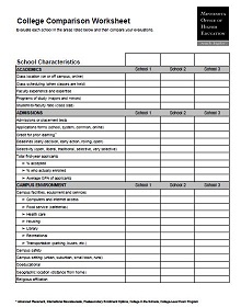
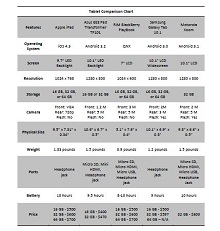
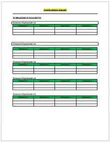
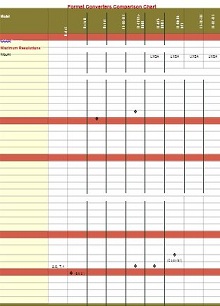
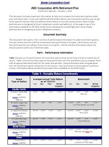
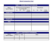
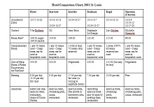
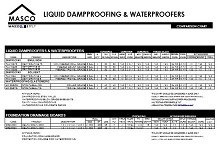
50+ Free Comparison Chart Templates [Word, PDF, Excel]
Before writing a comparison of two or more things you know well about these things/objects. Comparison is difficult sometimes, but it makes it easier to clearly state which one is better than the other. A comparison chart is the best way to compare two or more things, their difference, similarities, pros, and cons which helps to make the best decision quickly. Charts and graphs make it easier to understand.
- Accounting Templates
- Art & Media
- Budget Templates
- Business Templates
- Calendar Templates
- Certificates
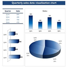
- Charts
- Education Templates
- Inventory Templates
- Invoice Templates
- Letter Templates
- Medical Templates
- Personal Templates
- Project Plan Templates
- Timesheet Templates
Below is a collection of comparison chart templates that help to make a comparison of two or more things/objects in a better way. You can check these templates and download too.
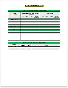
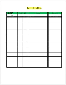
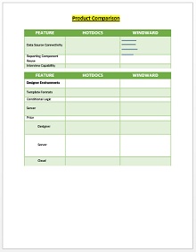
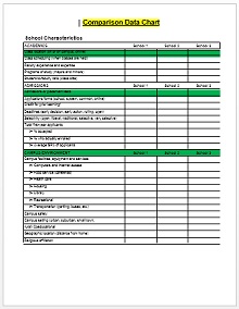
Download Free Comparison Chart Templates
What is a Comparison Chart
A comparison chart is a visual aid that outlines item differences and similarities. It simplifies the process of comparing multiple entities based on various criteria. It would be easier for viewers to digest and analyze information at a glance.
Comparison charts cut through the noise and help individuals and businesses make well-informed decisions that could range from everyday choices to strategic business moves.
Key Features of a Good Comparison Chart
Comparison charts are invaluable tools to present information concisely and appealingly. Here are the key features that distinguish a good comparison chart:
- Clarity and Simplicity: A good comparison chart should be easy to understand. Avoid clutter and complexity by presenting data in a clear and concise format.
- Relevant Data Points: Include only the most relevant data points to prevent overwhelming the audience. Focus on essential features or attributes that users commonly compare.
- Visual Appeal: Use colors, icons, and visual elements to enhance the chart’s appeal and make it more engaging. But ensure that visual elements don’t overshadow the data itself.
- Accuracy and Reliability: Ensure that the data presented in the chart is accurate and sourced from reliable sources. Misleading or incorrect information can undermine the credibility of the chart.
- Customization Options: Users can customize the chart according to their preferences. This could include sorting capabilities, filtering options, or hiding or showing specific data points.
- Accessibility: Make the chart accessible to users with disabilities by adhering to accessibility standards. Provide alternative text for images, ensure proper color contrast, and support keyboard navigation.
- Comparison Criteria: Clearly define the criteria used for comparison to avoid user confusion. Whether pricing, features, specifications, or performance metrics, users should understand what they’re comparing.
Different Types of Comparison Chart Templates
Comparison charts come in various types, each suited for different data visualization needs. Here are some popular types:
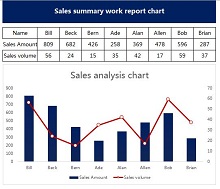
Combo Chart
Combo charts will be used When dealing with data that requires many measurement units or displays different trends that you want to compare simultaneously. They combine the elements of bar and line charts and allow a refined analysis of complex datasets. For example, use a combo chart to compare the sales volume (using bars) and the percentage growth (with a line) over time.
Doughnut Chart
Doughnut charts are a fun and effective twist on the traditional pie chart. These charts are excellent for showing proportions in a dataset, with the added benefit of a central space that can be used to display additional, related data. They are trendy for presenting categorical data in a more visually engaging and digestible format.
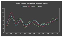
Line Charts
Ideal for showing trends over time, line charts help viewers pinpoint changes and patterns. They’re often used in business and finance to track variables such as revenue, stock values, and other continuous data. The clarity of a line chart lies in its simplicity and shows a clear progression or regression without any distractions.
Histogram
Histograms provide a visual representation of the distribution of numerical data. It would be easier for viewers to understand the frequency of data occurrences within different ranges. They are handy for statistics and in scenarios where it’s essential to grasp the occurrence patterns of particular events or measurements.
Bar Chart
Bar charts are one of the most widespread and straightforward comparison tools. By aligning rectangular bars either vertically or horizontally, they allow for quick comparisons amongst different categories. This chart type can easily showcase variations in values. It would be easier to compare inventory items, survey responses, or any categorical data.
Pie Chart
A pie chart is a classic choice for displaying parts of a whole. It provides a quick visual distribution of categories at a glance. The larger the piece of the pie, the more significant that part is about the data set. Pie charts are best utilized when the number of data points is low, and the differences in sizes of the segments are apparent.
Venn Diagrams
Venn diagrams are powerful tools for showing overlaps and intersections between datasets or groups. They offer a straightforward illustration of relationships and commonalities, making them particularly useful for logical comparisons and problem-solving.
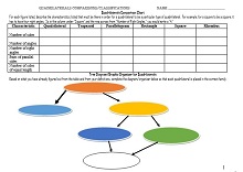
Mind Maps
Mind maps are great for comparing items more qualitatively. They are used to brainstorm or explore the connections and relationships between complex ideas. They offer a visual structure that starts with a central idea and branches out to show how various elements relate to the whole.
Double Bar Graph
Double bar graphs are an extension of the simple bar chart; they enable comparing two data sets. Often used in business and science, these graphs represent two related data types, like comparing monthly sales figures for two years.
Slope Charts
Slope charts are simple yet effective for comparing changes in data over two time points. Using lines to connect individual data points, they depict the rise or fall of the value. Such charts are impactful when comparing many categories to show the direction and steepness of change.

When to Use a Comparison Chart Template
Comparison charts serve as visual tools that simplify the process of contrasting different items or services, making them particularly useful in several scenarios:
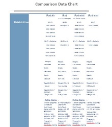
- Product Comparisons: When shopping for new gadgets, comparing technical specifications across models helps consumers pick the suitable device for their needs. In the grocery store, health-conscious shoppers can use comparison charts to evaluate nutritional information amongst various food products.
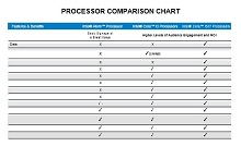
- Service Feature Comparisons: Businesses deciding on software-as-a-service (SaaS) products can drastically benefit from charts that compare features, user limits, and support options. Travelers might use comparison charts to weigh the services, prices, and locations of hotels or resorts.
- Price Evaluations: Price-sensitive consumers can use comparison charts to ensure they get the best deal on purchases, from everyday items to big-ticket electronics. Companies can evaluate suppliers and vendors, comparing bulk prices, payment terms, and delivery schedules.
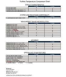
- Performance Assessments: Employers often use comparison charts to measure employee performance to compare sales figures, customer feedback, and task completion rates. In education, comparison charts help illustrate different schools’ or programs’ performance by comparing graduation rates, student-teacher ratios, and standardized test scores.
- Market Analyses: Entrepreneurs and businesses use comparison charts for market analyses. Financial analysts compare stocks or investment funds, looking at historical performance, fees, and portfolio composition.
How to Create a Template for Comparison Chart?
Creating a comparison chart is an effective way to represent information and aid decision-making visually. Here are the steps to create a compelling comparison chart:
Step 01: Define the Purpose of the Chart
Ask yourself, what decision are you making? Perhaps you’re comparing product features to help a purchase choice or examine data trends for a report. Defining the objective will shape every aspect of your comparison chart, from the type of chart you choose to the data points you highlight.
Step 02: Collect and Organize the Data
Gather the necessary data and ensure the information is up-to-date, relevant, and accurate. Flawed data can lead to incorrect conclusions and decisions. Organize the data in a logical format, which will then allow for straightforward transfer into your comparison chart.
Step 03: Choose the Right Template
Selecting the correct template is critical. Bar charts are excellent for comparing numerical changes over time. Venn diagrams illustrate relationships and commonalities between different datasets. Your choice should highlight the differences and similarities you want your audience to focus on.
Step 04: Modify the Chart
Modification enhances the readability and impact of your chart. Use colors, fonts, and sizes to highlight the main takeaway without distracting from the data. Colors should differentiate data clearly while maintaining a coherent design.
Step 05: Review and Finalize the Chart
Look over your chart for data accuracy and visual alignment with your purpose. Is it easy to understand? Does it convey the right message? Certain adjustments in design or emphasis can substantially increase clarity. Finally, ensure it’s free from typos and labeling mistakes.
How to Customize a Comparison Chart Template?
When creating effective comparison charts, it’s essential to approach your audience and the critical points of comparison. Tips to customize effective comparison charts
- Understand Your Audience: Consider the background and expectations of your audience. Are they experts in the field, or is the chart designed for someone seeing the data for the first time? This perspective will impact your design choices. It ensures that the chart communicates the necessary information to viewers.
- Conduct Thorough Market Research: Look into competitor offerings, market trends, and the unique selling points of each product. This boosts the credibility of your chart and provides rich insights for consumers to make well-informed decisions.
- Choose the Right Chart Type: The type of chart you select will influence its effectiveness. Align your chart type with the data presented to enhance the user’s understanding at a glance.
- Simplify the Design: Make it simple rather than overwhelming the viewer with data. Use clear, concise labels and avoid any unnecessary information that might distract from the critical points of comparison. A clean design will help your audience quickly grasp the differences and similarities.
- Highlight the Key Differences: Quickly identify the main distinctions to help a user choose. Use bolding, color-coding, or graphical icons to spotlight these differences.
- Employ Consistent Comparison Criteria: Apply the same criteria across all elements being compared to guarantee a fair and accurate representation. This consistency will add validity to your chart and enable your audience to compare apples to apples.
- Keep the Information Current: Regular updates with the newest data are necessary to maintain the chart’s relevance and usefulness. An outdated chart can mislead consumers and damage the credibility of your site. So, schedule routine reviews to keep your charts fresh and accurate.
Common Mistakes to Avoid While Making a Comparison Chart Template
When creating comparison charts, inevitable missteps can hinder their effectiveness. Here are some common mistakes to avoid:
Overcomplicating the Design
An overly complicated comparison chart can hinder rather than help understanding. Viewers may struggle to locate essential information amidst a sea of elements. To avoid this, prioritize simplicity and functionality. Adopt the ‘less is more’ philosophy to ensure every design element serves a clear purpose in illustrating the comparison.
Including Too Much Data
Including excess information can overwhelm your audience. The art lies in curating the data to only those details directly contributing to the comparison’s essence. The goal is clarity, not comprehensiveness; allow your audience to digest the most important points of contrast and similarity effortlessly.
Failing to Update the Chart
Data evolves, and what was accurate months ago may no longer reflect the current state. Regular updates are crucial to maintain the chart’s integrity and usefulness. An outdated comparison can lead to poor decision-making and tarnish your credibility.
Ignoring Audience-Specific Elements
Every audience has unique needs and levels of understanding. A critical mistake many make is ignoring these audience-specific elements. Modify your chart in the presentation of data and its accessibility to your intended audience. Consider literacy levels, cultural contexts, and the prior knowledge your viewers bring to the table.