
50+ Break-Even Analysis Graph Excel Template (Free Download)
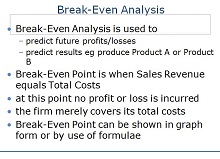
Break-even analysis is a powerful tool used by businesses to determine profitability potentials. It helps to identify how many sales need to be made to cover all costs, including operational and overhead expenses. When used correctly, break-even can give insight into what adjustments need to be made in order to increase profits or minimize losses.
Knowing when the break-even point is achieved ensures that all costs are accounted for and can potentially help business owners anticipate problems with cash flow. It also serves as an indication of whether the business should continue producing at current levels or reevaluate its strategy for success. In short, break-even analysis is an effective way of assessing financial health and steering companies toward success.
- Accounting Templates
- Art & Media
- Budget Templates
- Business Templates
- Calendar Templates
- Certificates
- Charts
- Education Templates
- Inventory Templates
- Invoice Templates
- Letter Templates
- Medical Templates
- Personal Templates
- Project Plan Templates
- Timesheet Templates
Download Free Break Even Analysis Graph Templates
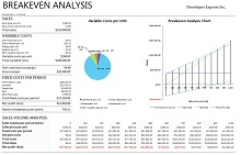
What is a Break Even Analysis Graph?
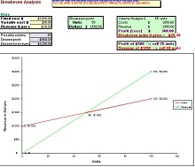
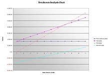
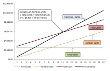
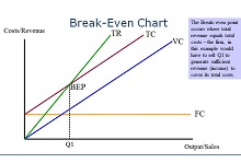
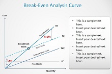
A break-even analysis graph is an essential tool for businesses that want to make sure their investments are profitable. It shows the relationship between total revenue and total costs over time, allowing you to calculate how much money your business needs to make in order for it to be considered “profitable”. By understanding this relationship, you can easily identify where your business stands when it comes to profitability and determine if any changes need to be made.
Benefits of Using a Break-Even Analysis Graph
Using a break-even analysis graph offers several benefits for businesses, including:
- Helping you understand your financial situation better so you can make informed decisions about how best to invest resources.
- Identifying areas where cost-cutting measures can be implemented without sacrificing quality.
- Setting realistic goals for profitability.
- Providing an easy way to track progress over time and ensure that resources are being used effectively.
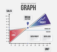
Importance of Break-Even Analysis Graph
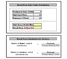
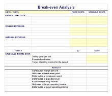
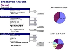
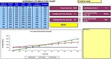
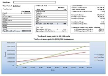
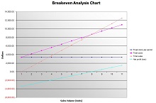
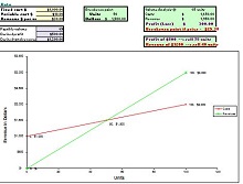
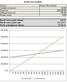
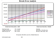
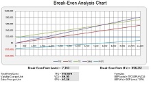
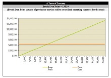
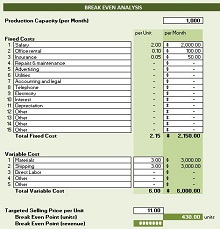
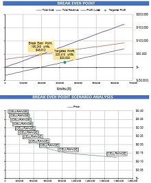
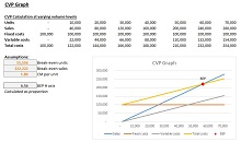
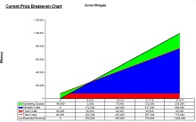
A Break-Even Analysis graph is one of the most effective tools to analyze business performance. It allows business owners to identify how much revenue they need to generate in order to cover costs and “break even,” or make a profit. The graph illustrates the cost, revenue and earnings per unit along with the break-even point.
By understanding each element of the graph, entrepreneurs can plan for potential expenses, estimate potential profits and understand when their company will become profitable. With a visual representation of business performance, investors can also quickly follow up on a company’s financial stability and risk assessment. In short, a Break-Even Analysis graph can play an important role in planning for the success of any business venture.

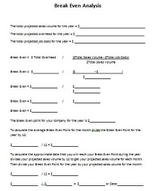
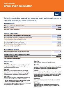
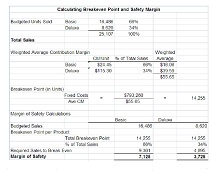
How to Create a Break-Even Analysis Graph Template in Excel
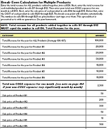
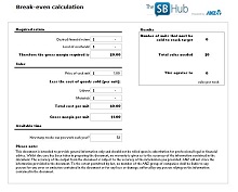
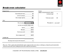
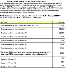
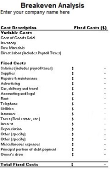
A break-even analysis is a key part of any business plan. It is a simple way to estimate how much revenue you need to generate to cover your costs of goods sold (COGS). A break-even analysis can also show you how many units you need to sell to reach your break-even point. Creating a break-even analysis graph template in Excel is easy and only takes a few minutes. Follow the steps below to create your own break-even analysis graph.
- Open Microsoft Excel and create a new spreadsheet.
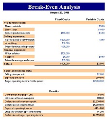
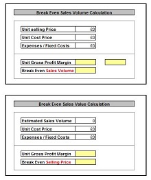
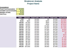
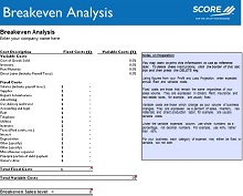
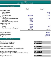
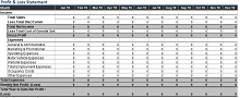
- Enter the following labels into cells A1 through E1: “Fixed Costs,” “Variable Costs,” “Price per Unit,” “Units Sold,” and “Revenue.”
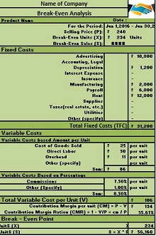
- Enter your fixed costs into cell A2. Fixed costs are those that remain the same regardless of how many units you sell, such as rent, insurance, and salaries.
- Enter your variable costs into cell B2—variable costs, such as materials and shipping, change based on the number of units you sell.
- Enter your price per unit into cell C2.
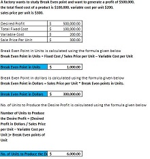
- In cell D2, enter the number of units sold that corresponds to your fixed costs in cell A2. For example, if your fixed costs are $10,000 and you sell 1,000 units, then your break-even point is 10,000/1,000 = $10 per unit.
- In cell E2, enter the number of units sold that corresponds to your total revenue (fixed + variable costs). For example, if your total revenue is $20,000 and you sell 1,000 units, then your break-even point is 20,000/1,000 = $20 per unit.
- Select cells A2 through E2 and insert a line graph. Your break-even analysis graph template is now complete.
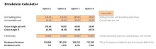
- Use your break-even analysis graph template to estimate how many units you need to sell to reach your desired level of revenue. Enter your desired revenue amount into cells A3 through E3 and observe where the line intersects the x-axis on the graph. This will tell you how many units you need to sell to reach your desired level of revenue.